Polar Plots
Explore polar plots that reveal how wind speed and direction shape Lewisham’s air pollution patterns.
What is a bivariate polar plot?
Bivariate polar plots help us to understand the origin of air pollution sources in the areas where air quality is being monitored in continuous, normally by making use of automatic monitoring techniques.
This is made by integrating the air quality readings that are being measured, with measurements of wind speed and wind direction taken at the monitoring site, during the same time period.
Polar plots display different colours. The darker colour of the surface corresponds to low pollutant concentrations, and the lighter colours to much higher concentrations.
Lewisham Plots
What is the map telling you?
The bivariate polar plots on the map use the last fortnight of data from air quality monitoring stations around Lewisham.
The colours on the markers represent the average pollutant concentrations at different wind conditions over the last 14 days.
Vertical and horizontal axes
Indication of the wind direction, in a similar way as a wind rose or a compass would, with the cardinal points N (North), S (South), W (West) and E (East) being displayed.
Circular dashed rings
An indication of the wind speed. This starts at zero (0 m/s) at the “bullseye” central point and slowly increases outwards in all directions.
Wind direction
Direction where the potential air pollution source is coming from.
Wind speed
Where this air pollution source is located: if very close to your monitoring location or if it comes from further way.
Examples
-
Site A
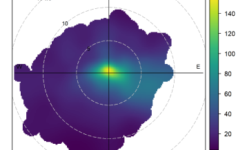
A high concentration pattern centred on the "bullseye" of the plot, with wind speeds close to zero in all directions, indicates a very local air pollution source.
-
Site B
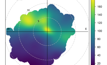
Elevated concentrations at higher wind speeds (5-10 m/s) from the North-West indicate a dominant pollution source in that direction.
-
Site C
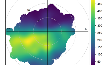
A typical roadside site shows clear offset and dispersion of pollution levels across various wind speeds and directions (South to West).
Top tip: When using the polar plot map, remember that the size of each marker isn’t important. The radial axes show wind speed, not distance from the monitoring site. What matters is the direction the air is coming from; this helps identify where the highest pollution concentrations are likely to originate.
By default, the map displays NO₂. You can also view ozone and particulate matter, each shown using its own colour scale, by selecting a different pollutant from the menu.